But there have also been unpleasant surprises, the most unpleasant of which has been streamlining the embed code generator. It's had the noddy and big-buttons makeover which characterises the tablet-focussed web, accompanied by its usual reduction of options. So now, instead of asking you if you want their code snippet to top and tail your image with a bunch of text, it just does it, automagically.
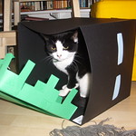
This is quite tiresome, especially at small sizes, where the code top-and-tail can almost double the height of the image. I appreciate that they're just dying to say "hosted on Flickr" right where you can see it, but really when that information is a hover or a click away, is it really needed?


Naturally, given that if you're embedding you're often in code view anyway, stripping this additional bobbins out is a moment's work. But I'm old enough to be in the count-down to arthritis, and every click counts.
Edited to add: The code no longer seems to be loading effectively (I suspect to no-one's great sorrow) but it added almost a centimetre of logoed and betexted space above and below the image.


