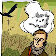
Communications, delivery of information. Which bits of information I go looking for, and why. And why, so often, I end up looking for what I want on google images.
the desire to wander
There are things I need to know this march: where high heeled wellies come from, what to do with a solitary bee that's come out of hibernation too early, and the relationship between stroke and migraine. But I don't need this knowledge for my day-to-day existence. I can be briefly amused by the high-heeled wellies, forget about the bee, and believe my doctor when he says the migraines don't and won't increase the stroke risk. But I'm not after the information I need for survival. I've looked for that online, of course -- my job involves providing that sort of how-to-get-a-job, how-to-spot-a-villainous-landlord, how-to-convince-someone-you-need-medical-attention information, and plenty of people provide it (and use it) online, but this is never going to be the bulk of someone's internet use if they're a regular user. They, like me, will be after the information that enriches life, that surrounds the bare facts with details, reports, pictures and personal histories. For this, the internet, with its scattering of (on the one side) incomplete, misleading and badly-spelled blogrumours, message board and opinion pieces, and on the other intimidatingly technical papers escaped from extranets and subscriber services is the ultimate reward for the enthusiastic amateur, people into informal learning techniques and self-motivated research. Ironically, this sort of information fiddler, the person who goes gathering odd news stories, strange histories and interesting facts, will also be the person best able to track down the information they really need, when they need it. They have the skills, the Google Fu.
But one of the central problems with my job is that I'm often not dealing with the expert users. I'm looking at first-timers, people with limited access and little time, inexperienced, and at sea in the online information swamp.
freedom to wander
The trouble is that attempts to organise information often seem only to obscure it. Put things into categories, and people get lost between whether an STI is a health problem, or a relationship problem. Any attempt to be comprehensive leaves you with more data than can be feasibly grasped. Go for the Q&A approach, and it's all to easy to frustrate people by losing them down blind alleys. It's also too slow; even the least experienced user is accustomed to google's expertise at delivering you exactly what you want on the first search. But, on one site, a full text search only works if you're smart with the words you use; that too, is another technique you have to learn, before you can stop getting far too many results, or the wrong results. So getting the user to the information they want is a headache, and in the youth information area the result has been a plethora of bizarre interfaces, all aimed at gently herding the user to the information, while keeping them entertained on the way.
But, herding the user is actually entirely counter to how the web works. We're talking self-motivated research here, we're talking user-lead navigation. Or at least, we should be. The user needs to be in control, especially in difficult areas where they is a lot of alarmist disinformation. Otherwise, they're pretty much justified in going off and looking somewhere else; asking their mates, perhaps. Maybe someone with mad google skillz who can dodge the bullshit and hit the paydirt.
optimised to wander
This isn't great, though. It doesn't encourage independence, increased confidence, better life-skills and all of those other intangibles but usefuls that help round out an individual into someone mature, autonomous, balanced. We don't want grabbing knowledge off the web to be the province of a few geeks and willows who are lauded when useful and despised for their knowledge at other times. Being able to find information online should be a general life-skill.
But all this herding and ringfencing and directing of inexpert users is not encouraging them to use the internet. They may get familiar with a few sites and some sites trade on this, keeping users inside their "online experience". But this is the province of people marketing a product, and information is not a product, no matter how tempting it is to market it.
The really good web architectures should reinforce the strengths of the medium by enabling a more efficient method of wandering; a more scenic route with more pretty pictures, colourful facts, mysterious-looking sidetracks and hopeful-looking vistas. They should tempt the users into exploring the potential of the medium; more pied piper than sheep-dog.
So good old google, while is gives much the expected results on the basic search, quickly drifts into the weird and wonderful with the images, and provides breadth and currency with the news search. The visual cues help organise thoughts and spot sites which duplicate content; broadening, rather than narrowing the approach to information.
Subscribe to:
Post Comments (Atom)


No comments:
Post a Comment